


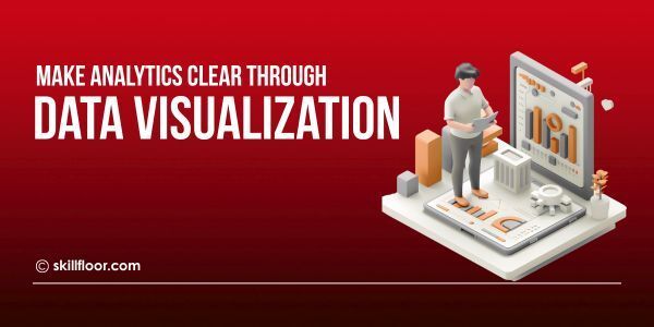
Visualization in Data Analytics: Turn Insights into Action
Discover how data visualization in data analytics helps turn complex numbers into clear insights, making it simple to spot patterns and take smart actions fast.
Imagine trying to understand the meaning of countless charts, tables, and data while seated in front of all. It may seem too much to handle. Today's businesses deal with this issue daily. More data is added with each click, sale, or engagement, making it challenging to identify what matters.
Data visualization can be helpful in this situation. It converts incomprehensible numbers into easily understood narratives. Visualization helps teams make more informed decisions by highlighting patterns and trends, just like a map would help you navigate a confusing city. Learning the right skills, for example, by enrolling in a data analytics course, might facilitate this process.
Even with images, some people can experience difficulties. Cluttered dashboards, deceptive graphics, and ambiguous insights are all possible. The secret is to know how to read and employ the right pictures. Once data is comprehensible, it can be used to inform decisions and help companies grow.
What is Data Visualization?
Using visuals such as maps, graphs, and charts to display information is known as data visualization. Rather than examining lengthy statistical tables, consumers can rapidly get the meaning of the data. Seeing patterns, trends, or distinctions that are difficult to discern from numbers alone is made easier with its assistance.


Understanding complex data is helped by the use of visuals. It transforms unprocessed data into narrative images. Anyone can understand the information in this way, even if they lack extensive technical understanding. Making data understandable and practical for actual decision-making is the goal of data visualization, not merely creating eye-catching charts.
Why Data Visualization Matters in Today’s Data-Driven World
-
Simplifies Complex Data: Every day, organizations produce huge amounts of data. People may easily grasp important insights without falling down in lengthy spreadsheets due to visualization, which transforms this complex information into understandable graphics.
-
Reveals Patterns and Trends: Finding trends, connections, and odd patterns that can go unnoticed when examining raw data or tables is made simple by charts and graphs.
-
Improves Decision-Making: Teams may make better, quicker decisions that direct strategy and enhance overall business performance by using data visualization to help them spot opportunities and dangers more quickly.
-
Enhances Communication: Compared to lengthy reports or tables, visuals are simpler to comprehend. They make it possible for stakeholders and teams to efficiently exchange thoughts and swiftly assimilate crucial information.
-
Drives Actionable Insights: Data visualization facilitates the conversion of numbers into useful tactics. It shows what steps to take, making it easier to enhance processes, products, or services.
-
Encourages Collaboration: Discussions between teams are helped by visual data. Clear graphics facilitate teamwork, shared knowledge, and quicker problem-solving when everyone can see them.
The Role of Visualization in Data Analytics
In data analytics, visualization is essential because it transforms uninterpreted data into insightful knowledge. By making data easier to digest and more useful, it assists organizations in tracking performance, identifying correlations, and successfully communicating findings.
-
Simplifies Data Interpretation: Understanding complex numbers is made easier by data visualization. People can rapidly notice patterns, trends, and insights instead of reading lengthy tables, which saves time and clears up confusion.
-
Supports Better Decision-Making: Teams can make better decisions with the use of visual data. Businesses may respond more quickly and develop strategies based on accurate, comprehensible data when patterns and relationships are plainly visible.
-
Identifies Patterns and Anomalies: Trends, connections, and odd data points can be found with the help of charts and graphs. Spreadsheets can hide these ideas, but images make them obvious.
-
Communicates Insights Clearly: Data becomes stories through visualization. In order for teams to exchange data and act without misconceptions, it helps everyone—even non-technical people—understand discoveries quickly.
-
Drives Strategic Actions: Organizations are able to plan actual activities through the visual representation of data. For greater outcomes, visual insights direct enhancements in operations, marketing, sales, and other areas.
-
Encourages Collaboration: Teams can collaborate easily when data is presented visually. The fact that everyone has access to the same data facilitates dialogue, problem-solving, and consensus-building.
Types of Visualizations and Their Use Cases
1. Line Charts
A line chart is an excellent tool for displaying changes over time. By applying data analytics tools for visualization, they make trends simple to monitor and assist companies in rapidly identifying growth or decline.
Use Case: A company monitors monthly website traffic in order to spot growth prospects, spot seasonal trends, and carefully schedule marketing initiatives during periods of high interaction.
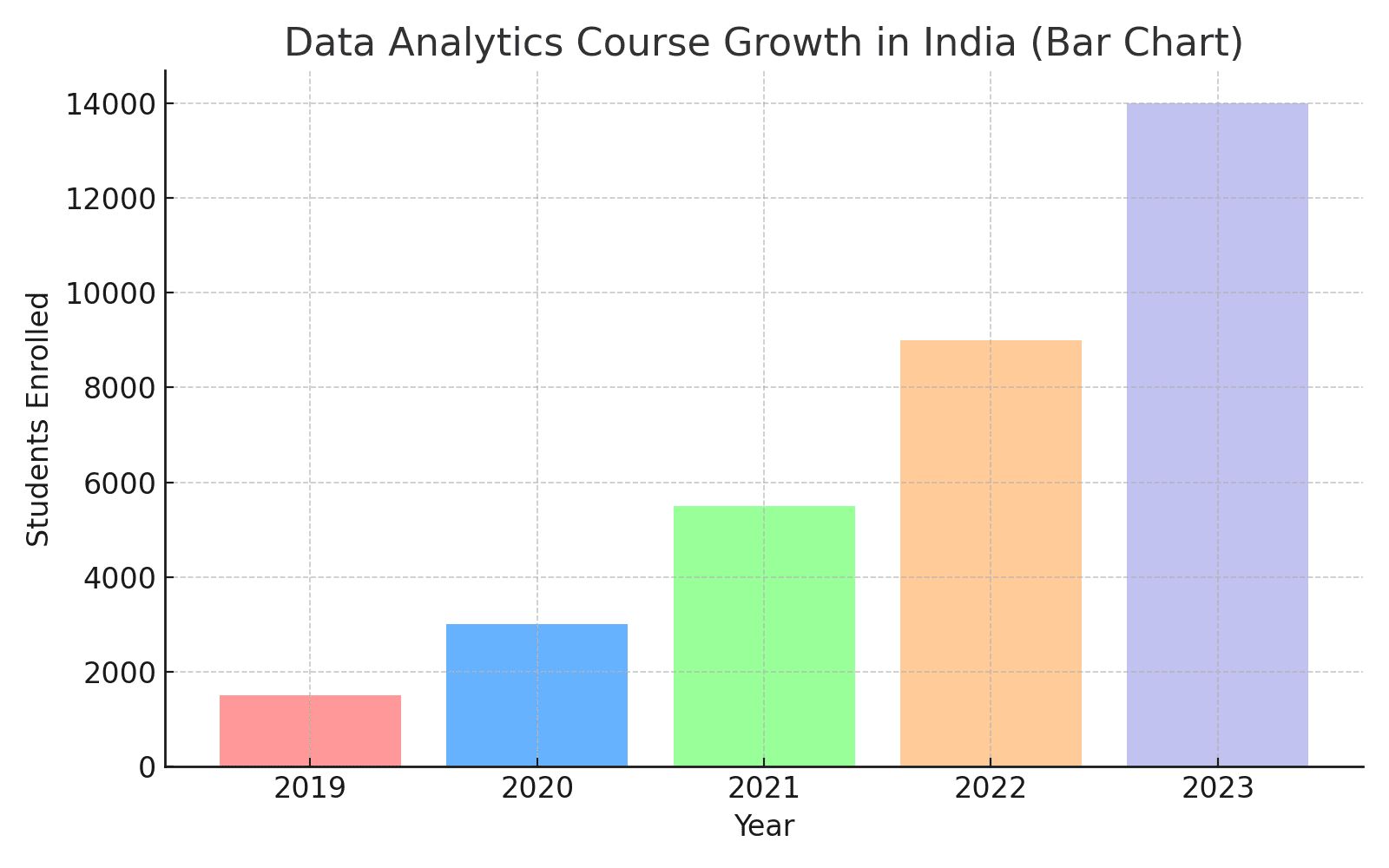
2. Bar Charts
Bar charts provide an easy comparison of values across categories. For side-by-side comparisons of items, departments, or outcomes, they are simple, quick to read, and ideal.
Use Case: To find the best-performing branch and effectively modify marketing plans or inventory for underperforming branches, a corporation examines monthly sales across various store locations.
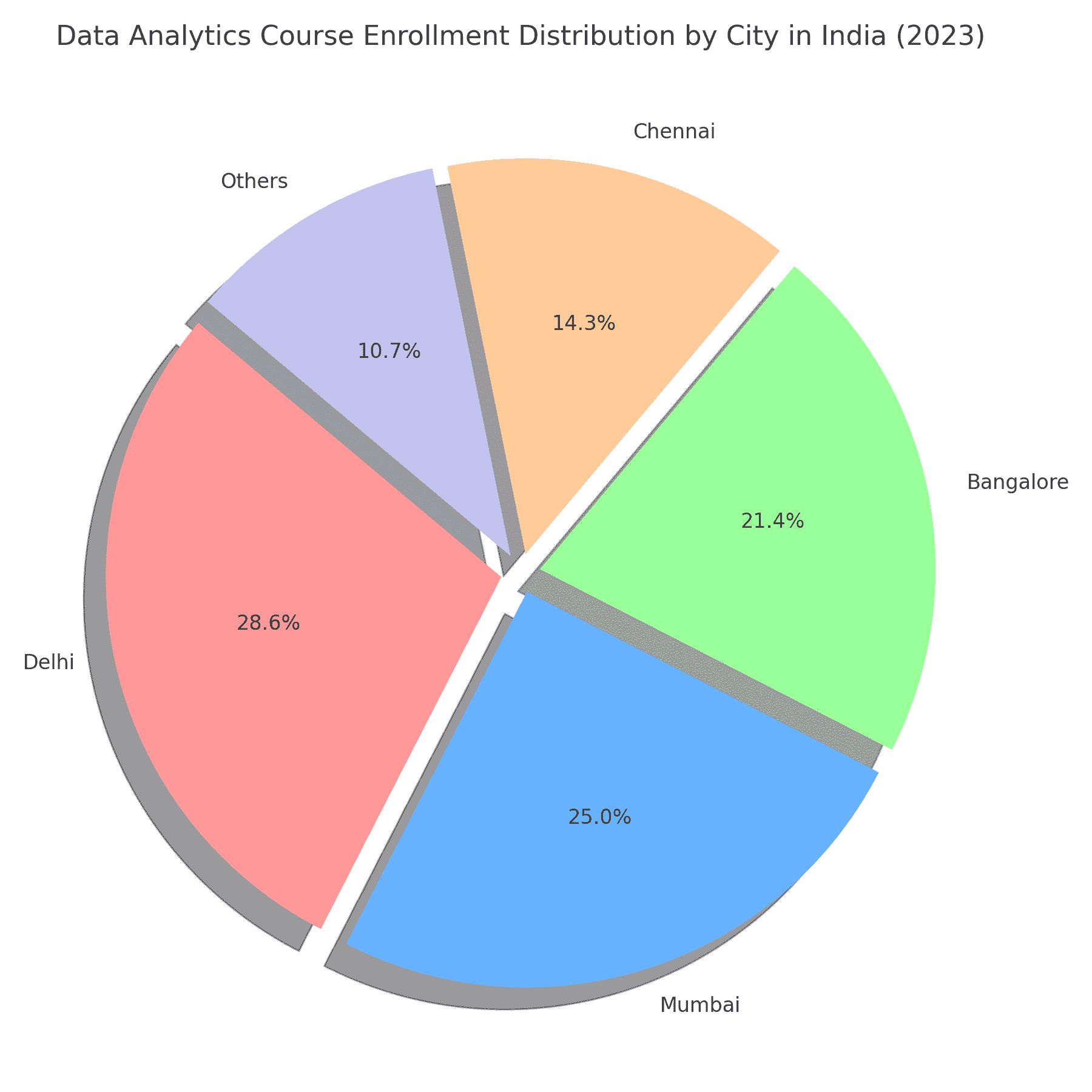
3. Pie Charts
The proportions within a total are shown in pie charts. They make overall distribution easier to express by helping to visualize how several components contribute to the whole.
Use Case: In order to efficiently prioritize spending, a marketing team shows how the whole budget is split across advertising, content production, design, and research.


4. Heat Maps
Colors are used in heat maps to symbolize values. By displaying intensity or frequency, they help with the visualization in data analytics techniques to pinpoint problem areas or high-performing zones.
Use Case: To improve website structure and user experience, an e-commerce website examines user interactions and page clicks to pinpoint high-traffic regions.
5. Scatter Plots
Scatter plots can be used to show how two variables relate to one another. Trends, clusters, or outliers in datasets are highlighted, and the relationship between one factor and another is shown.
Use Case: In order to identify the most efficient budget range for maximizing revenue, a researcher examines the connection between advertising expenditure and sales growth.
6. Dashboards
A comprehensive picture of corporate performance is provided by dashboards, which integrate several charts into a single view. For quick insights, they are crucial tools for visualization in data analytics.
Use Case: A store manager uses a single interactive dashboard to track daily sales, inventory, and customer feedback in order to spot problems and efficiently maximize operational performance.
Best Practices for Data Visualization in Data Analytics
1. Know Your Audience
Effective data visualization requires an understanding of your audience. To make it easier for them to understand findings during exploratory data analysis, customize dashboards and charts according to their goals, interests, and level of understanding.
-
Consider what your audience is already familiar with and the metrics that are most pertinent to their work. Visuals should be presented in an understandable and significant manner.
-
Reduce the amount of technical jargon and detail so that visitors can rapidly understand the key points without becoming confused or overly complicated.
2. Choose the Right Chart
Selecting the right chart type is crucial for effective communication. During data analysis, choose a chart that best illustrates trends and comparisons because each one displays data differently.
-
Bar charts are used to compare categories, and line charts are used to display changes over time. Select images that help viewers understand patterns and distinctions.
-
In contrast to scatter plots, which show relationships, pie charts are good at displaying proportions. Making sure the type of chart matches the data guarantees that your audience can accurately and swiftly grasp insights.
3. Keep It Simple
Stay away from busy images. Employ simple layouts, sparse color schemes, and unambiguous labels to help your audience rapidly grasp the main points. Exploratory data analysis is more effective and helpful when it is straightforward.
-
Eliminate unnecessary lines, superfluous data points, or ornamental aspects that don't contribute value so that the most significant trends and patterns in your images can be seen.
-
Prioritize clarity by emphasizing important details, maintaining simple charts, and steering clear of complex designs to help visitors understand insights without feeling overwhelmed or challenged.
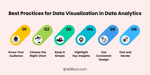
4. Highlight Key Insights
Concentrate on the most crucial information. Make trends and outliers stand out with colors, sizes, or annotations to help viewers in rapidly comprehending important findings from data analysis.
-
By utilizing colorful shades, shapes, or callouts to highlight patterns or anomalies, you may help your audience quickly identify the most important information without having to look through the entire chart.
-
Give important points brief explanations with labels or notes to help visitors grasp the insights and act on the data visualization.
5. Use Consistent Design
Ensure that all dashboards and charts have consistent styles. Using consistent layouts, colors, and fonts makes it easier for your audience to read and understand the data, which enhances clarity while conducting exploratory data analysis.
-
To make charts and graphs appear consistent and make them easier for viewers to follow and comprehend, use a consistent color scheme and font style across all graphics.
-
To increase the effectiveness of your message, keep labels, headings, and axes formatting constant throughout various graphics. This will let viewers compare data easily and without misunderstanding or distraction.
6. Test and Iterate
Get input on your visualizations to make sure they successfully convey insights. Make constant improvements to dashboards and graphics to increase their impact and clarity when analyzing data.
-
To find out which aspects of your visuals are clear and which require development, share them with stakeholders or coworkers. Then, make the necessary adjustments based on their recommendations for improved comprehension.
-
Update and refine charts frequently by experimenting with different layouts, colors, and designs to ensure that the audience can rapidly understand the most important patterns and insights from your data.
Best Tools for Data Visualization
-
Excel: Excel is an easy-to-use program for making pivot tables, charts, and graphs. It's excellent for rapid visualizations and basic dashboards that don't require complex technical knowledge.
-
Google Data Studio: A free online tool that lets users create dynamic reports and dashboards. It's perfect for merging various data sources and effortlessly sharing insights with groups.
-
Tableau: Tableau is a platform for professional data visualization that generates interactive charts and dashboards. It assists companies in gleaning useful insights, patterns, and trends from intricate databases.
-
Power BI: For real-time dashboards and reports, Microsoft Power BI is ideal. It is perfect for tracking performance and important indicators because it interfaces with other systems with ease.
-
Python (Matplotlib/Seaborn): Customizable charts and graphs are made possible by Python packages such as Matplotlib and Seaborn. They're great for programmers who want complete control over visualization and for advanced analytics.
-
Looker Studio: Teams can simply study data with Looker Studio's interactive dashboards and visualization options. It's particularly helpful for joint insights between the operations, sales, and marketing departments.
How Visualization in Data Analytics Drives Actionable Insights
-
Identifies Key Patterns: Businesses can concentrate on areas that require attention or improvement by using visualization to uncover trends and patterns in complex data that might otherwise go overlooked.
-
Highlights Opportunities: Through the display of high-performing products, markets, or campaigns, visualization enables teams to identify growth prospects and make confident, proactive, data-driven decisions.
-
Pinpoints Problems Quickly: Dashboards and charts make it simple to spot abnormalities or underperforming areas, assisting companies in resolving problems before they worsen and have an impact on outcomes.
-
Supports Faster Decisions: By reducing the amount of time spent deciphering figures, data visualization helps teams and managers make prompt, well-informed decisions that boost productivity.
-
Enhances Collaboration: Team members can more easily communicate insights when they have shared graphics, which promotes coordination, brainstorming, and alignment across departments or stakeholders.
-
Measures Impact of Actions: Teams can monitor the outcomes of their choices with visualization, demonstrating whether modifications result in gains and guiding changes for upcoming plans.
Case Studies / Real-World Examples
-
Retail Sales Optimization: Dashboards were utilized by clothes shops to monitor sales by location and product. Top-selling products and failing stores were identified using visualization, which assisted them in modifying their inventory and marketing strategies to boost sales.
-
Healthcare Patient Monitoring: A medical facility used trend charts and heat maps to monitor patient readmission rates. By highlighting therapies associated with increased readmissions, the visualization helped staff modify care plans and enhance patient outcomes.
-
E-commerce Website Analysis: Heat maps were used by an online retailer to examine user clicks and page views. By displaying the most interesting pages, visualization helped to improve website design and increase user experience.
-
Education Performance Tracking: Dashboards were used by a school to monitor student test results. Teachers were able to deliver targeted interventions and enhance overall academic achievement by using visualization to identify kids who needed additional attention.
-
Marketing Campaign Insights: Bar charts and line graphs were used by a marketing team to track social media participation. The optimum posting times and content were identified using visualization, increasing reach and ROI.
-
Supply Chain Optimization: A logistics company used interactive maps to display shipment routes and delivery schedules. They were able to efficiently simplify operations and save delivery costs by using visualization to show delays and bottlenecks.
Although data can be daunting, it is crucial to transform it into understandable, insightful information. Teams are more confident and make better decisions more quickly when they can quickly identify patterns, trends, and anomalies. Businesses, educational institutions, and organizations are able to understand what is going on and what to do next by using visualization in data analytics as a link between raw data and practical action. Through the use of interactive graphics, dashboards, and charts, teams are able to identify opportunities, resolve issues, and monitor the outcomes of their work. The secret is to make images clear, concise, and significant. Anyone who understands data analytics visualization may transform complicated data into insights that promote productivity, growth, and improved results in all facets of the workplace.