Techniques and Visualizations for Data Exploration
Explore data effectively with techniques and visualizations. Discover how to analyze and present data insights with our comprehensive guide.
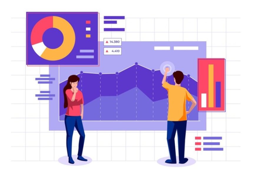
Data is the cornerstone of modern decision making, but its true value lies beneath the surface. Exploratory Data Analysis (EDA) is the compass that guides us through the labyrinth of numbers, revealing insights, patterns, and correlations that might otherwise remain concealed. We will embark on a journey through the techniques and visualizations that illuminate the hidden stories within data, enabling us to make informed decisions and uncover the extraordinary amidst the ordinary.
Data exploration in the data science process
Data exploration is a fundamental pillar of the data science process, serving as the gateway to understanding the intricate nuances of a dataset. It involves delving into the data, uncovering patterns, correlations, and outliers that might otherwise go unnoticed. By immersing ourselves in the data through exploration, we gain valuable insights that lay the groundwork for more advanced analyses and modeling. This initial phase not only informs our decisions on preprocessing and feature engineering but also guides us toward asking the right questions and formulating hypotheses. In essence, data exploration is the compass that points us toward the hidden treasures within the data, shaping the trajectory of our entire data science journey.
Exploratory Data Analysis (EDA) Basics
Exploratory Data Analysis (EDA) is a foundational step in the data analysis process that involves systematically examining and summarizing the main characteristics of a dataset. It serves as a preliminary investigation to understand the data's underlying structure, patterns, and relationships. EDA encompasses a range of techniques, tools, and visualizations that allow data scientists and analysts to gain insights, identify potential issues, and make informed decisions about subsequent analysis steps.
The Role of EDA in Data Analysis
EDA plays a critical role in the data analysis workflow for several reasons. First and foremost, it provides a comprehensive overview of the dataset's content and quality. By exploring the data through EDA, analysts can quickly assess the data's reliability, completeness, and potential errors. This aids in making informed decisions about data preprocessing and cleaning strategies.
Additionally, EDA helps researchers understand the distribution of variables within the dataset. It allows for the identification of trends, patterns, and anomalies that may be hidden beneath the surface. This insight is invaluable for selecting appropriate analysis techniques, designing effective models, and deriving meaningful conclusions.
Crucial Insights from EDA
Understanding data distribution is at the heart of EDA. By examining the distribution of variables, data practitioners can gain insights into the central tendencies (mean, median, mode) and spread (standard deviation, range) of the data. This knowledge is essential for setting expectations, detecting outliers, and deciding on appropriate transformations.
Moreover, EDA helps uncover relationships and correlations between variables. These insights are particularly useful in fields like finance, marketing, and social sciences where understanding how variables interact can lead to predictive models and informed decision making.
Data Preprocessing
Data preprocessing is a critical initial step in the data exploration process. It involves several key tasks to ensure that the data is clean and ready for analysis.
Data cleaning is about identifying and addressing errors or inconsistencies in the dataset. This may include fixing typos, resolving inconsistencies in data formats, and removing duplicate records. Cleaning the data ensures that it is accurate and reliable for further analysis.
Missing data can significantly impact the quality of analysis. In this step, you'll identify missing values and decide on an appropriate strategy to handle them. This could involve imputation, removal of rows with missing values, or using advanced techniques to estimate missing values.
Data transformation is necessary to make the data suitable for analysis. It can involve various operations like scaling, encoding categorical variables, or creating new features. Transformation ensures that the data is in a format that machine learning algorithms can work with effectively.
Outliers are data points that deviate significantly from the majority of the data. Identifying and dealing with outliers is crucial as they can skew statistical analysis and modeling. Treatment options may include removal, transformation, or the use of robust statistical methods to mitigate their impact.
Univariate Analysis
Univariate analysis is the initial step in data exploration, focusing on individual variables or attributes within a dataset. It aims to provide a comprehensive understanding of the data's characteristics. Here are the key components of univariate analysis:
Descriptive statistics offer a summary of the central tendencies and variability of a single variable. Common measures include mean, median, mode, standard deviation, and range. These statistics provide insights into the dataset's distribution and basic properties.
Histograms visualize the distribution of a numeric variable by dividing it into bins or intervals. Each bar represents the frequency or count of data points falling within a specific range. The shape of the histogram can reveal information about data patterns, such as skewness or multimodality.
Box plots, also known as box-and-whisker plots, display the distribution of a numeric variable's data. They provide information about the median, quartiles, and potential outliers. Box plots are particularly useful for identifying the spread and central tendency of data, as well as any unusual observations.
Frequency tables are used for categorical data to show the distribution of categories and their corresponding frequencies. They help in understanding the prevalence of different values within a variable. Frequency tables are often accompanied by bar charts or pie charts for a visual representation.
Categorical Data Visualization
Bar Charts:
Bar charts are a common and effective way to represent categorical data. They display categories on one axis and the corresponding frequencies or values on the other. Bars of varying lengths or heights are used to compare and contrast the categories, making it easy to identify trends and patterns. Bar charts are particularly useful for showing how different categories compare in terms of quantity or frequency.
Pie Charts:
Pie charts are circular representations divided into slices, where each slice represents a category or proportion of a whole. They are suitable for displaying the relative distribution of categories or parts of a whole. Pie charts provide a visual way to see the composition of a dataset and are often used to show percentages or proportions.
Count Plots:
Count plots are a specialized form of bar chart that focuses on counting the frequency of each category in a categorical variable. Each category is represented by a bar, and the height of the bar corresponds to the number of occurrences. Count plots are especially useful when you want to visualize the distribution of a single categorical variable and observe its frequency distribution.
Time Series Data Exploration
Time series plots are fundamental for understanding temporal data. They display data points in chronological order, allowing you to observe trends, patterns, and seasonality. Time series plots help in identifying long-term changes and irregularities within the data, serving as a starting point for deeper analysis.
Seasonal decomposition techniques break down time series data into its key components: trend, seasonality, and residual (error). This process enables the isolation of recurring patterns, such as daily, weekly, or yearly fluctuations. Seasonal decomposition is crucial for modeling and forecasting time-dependent data.
Autocorrelation measures the relationship between a time series and its lagged versions. It helps identify the presence of serial correlation, which is essential for selecting appropriate models like ARIMA. Partial autocorrelation, on the other hand, determines the direct relationship between observations at different lags, aiding in model order selection and refinement. These tools are vital in time series analysis to uncover dependencies and structure within the data.
Dimensionality Reduction
Principal Component Analysis (PCA)
Principal Component Analysis is a widely-used technique that helps reduce the dimensionality of data while preserving as much variance as possible. PCA identifies linear combinations of features (principal components) that capture the most information. By projecting data onto these components, it simplifies complex datasets, aids in visualization, and can enhance the efficiency of machine learning models.
t-Distributed Stochastic Neighbor Embedding (t-SNE)
t-SNE is a non-linear dimensionality reduction technique that excels in preserving the local structure of data points. It's especially useful for visualizing high-dimensional data in a lower-dimensional space. By modeling pairwise similarities between data points and minimizing the divergence between probability distributions in the high-dimensional and low-dimensional spaces, t-SNE reveals clusters and patterns that might be obscured in the original feature space. It's particularly popular for visualizing complex data, such as in natural language processing and image analysis.
Advanced Visualizations
Violin plots combine the benefits of box plots and kernel density estimates to display the distribution of data. They provide a summary of data distribution, showing not only quartiles but also the entire probability density function. Violin plots are particularly useful for comparing the distribution of multiple categories or groups, offering insights into data spread and skewness.
Radar charts, also known as spider or star plots, are effective for visualizing multivariate data across different variables. Each variable is represented as a spoke emanating from the center, and the shape of the polygon formed by connecting the points on these spokes conveys information about the data points' values. Radar charts are helpful for comparing profiles or patterns among different entities, such as individuals or products.
Sankey diagrams are flow diagrams that show the flow of resources, energy, or data between different entities or processes. They use directed arrows to illustrate the transfer or transformation of quantities, making them invaluable for visualizing complex systems or processes. Sankey diagrams help identify inefficiencies, understand resource allocation, and pinpoint critical paths within a system or network.
These advanced visualizations provide data explorers with powerful tools to gain deeper insights into their datasets and effectively communicate complex information to stakeholders or decision-makers.
Data Exploration Tools
Python Libraries (Matplotlib, Seaborn)
When it comes to data visualization in Python, Matplotlib and Seaborn stand out as powerful tools. Matplotlib offers a versatile foundation for creating static visualizations, enabling you to generate various types of charts and graphs with fine grained control. Seaborn, built on top of Matplotlib, provides a higher level interface for creating aesthetically pleasing statistical visualizations. For instance, with just a few lines of code, you can create bar plots, scatter plots, and even complex heatmaps. These libraries empower data scientists and analysts to effectively communicate insights and patterns from their data.
Interactive Visualization Tools (Plotly, Tableau)
For those seeking to take data exploration a step further, interactive visualization tools like Plotly and Tableau open up exciting possibilities. Plotly, a Python library, enables the creation of interactive charts, graphs, and dashboards that allow users to zoom, pan, and hover for more detailed insights. On the other hand, Tableau offers a user-friendly interface for creating interactive visualizations without the need for extensive coding. Interactive visualizations not only enhance the depth of exploration but also facilitate better understanding by enabling users to directly interact with the data, uncovering insights that might otherwise remain hidden.
Mastering the techniques and visualizations for data exploration is akin to wielding a flashlight in the dark, revealing the intricate contours of your dataset. By delving into summary statistics, histograms, scatter plots, and more, you empower yourself to unearth hidden patterns, correlations, and outliers that might otherwise remain obscured. This journey of discovery not only provides a richer understanding of your data but also lays the foundation for more advanced analyses and modeling. So, armed with these insights, embark on your data exploration journey with confidence, knowing that the story your data holds is waiting to be told through the lens of insightful visualizations and thoughtful analysis.






![A Complete Guide to 10 Cybersecurity Domains [2026 Update]](https://s3.us-east-1.amazonaws.com/skillfloor-website/uploads/images/202603/image_870x580_69ba9f637fe64.jpg)


