


Mobile Optimization Tips to Boost Your Site's Performance
Enhance your website's performance with these mobile optimization tips. Boost visibility and engagement for improved user experience.

In our increasingly mobile world, Mobile Optimization is key to improving your website's performance. As more people use smartphones and tablets to browse, making sure your site is mobile-friendly is vital. Start with responsive design, which adjusts your site’s layout to fit any screen size seamlessly. This not only enhances user experience but also aligns well with search engine guidelines, potentially improving your site’s ranking. Incorporating faster-loading images and compressing files can help your site load quickly, keeping visitors engaged and reducing bounce rates. Mobile Optimization is a fundamental part of a successful digital marketing strategy, enabling businesses to connect with a wider audience effectively.
Additionally, Mobile Optimization involves making your site easy to navigate on smaller screens. Simplify menus and ensure buttons are large enough to tap comfortably. This can make a big difference in how users interact with your site, encouraging them to stay longer. Crafting mobile-friendly content, with clear text and inviting call-to-actions, helps keep users interested. Integrating Mobile Optimization into your broader digital marketing efforts, including SEO and social media, can attract more visitors and keep them coming back. By focusing on Mobile Optimization, you can enhance your site’s performance and support your overall digital marketing objectives.
Tips to Boost the Performance
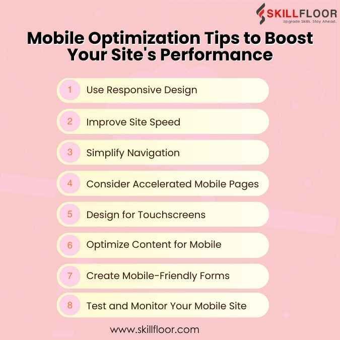
1. Use Responsive Design
Responsive design means that your website adjusts automatically to meet any screen size. This is necessary for offering a positive user experience on mobile devices. Here's how to use responsive design:


-
Flexible Layouts: Use CSS media queries to change your site's layout depending on screen size. This way, your content will look amazing on all devices.
-
Resizable Images: Ensure that images can be resized to suit their container or expand images seamlessly for optimal viewing. CSS sets the max-width of pictures to 100%, ensuring that they adjust to the screen size.
-
Viewport Settings: Use the viewport meta element in your HTML to manage how your page is scaled on mobile devices. Set it to width=device-width and initial-scale=1.0.
2. Improve Site Speed
Mobile consumers frequently anticipate speedy load speeds. A sluggish website might contribute to increased bounce rates. Here's how to accelerate your mobile site:
-
Reduce HTTP Requests: To improve loading times, limit the quantity of items such as photos, scripts, and stylesheets.
-
Compress Images: Use tools to compress and resize images while maintaining quality. Formats such as WebP can help your graphics load more quickly.
-
Enable Caching: Store portions of your site in users' browsers so they do not have to reload the complete page each time they come.
-
Use a CDN: A material Delivery Network (CDN) distributes your material across numerous servers, shortening the time it takes for your website to load.
3. Simplify Navigation
On smaller screens, navigating should be simple. Here's how to improve the navigation on your mobile website:
-
Simplified Menus: Use a hamburger menu or a condensed top bar to keep things organized and make it easier for consumers to find what they need.
-
Easy-to-Tap Buttons: Make sure the buttons and links are large enough to tap with a finger.
-
Sticky Navigation: Keep the menu visible while users scroll, so they don't have to return to the top to navigate your website.
4. Consider Accelerated Mobile Pages (AMP)
AMP is a framework for creating sites that load quickly on mobile devices. Here's why AMP is useful:
-
Fast Loading: AMP pages are designed to load rapidly, enhancing the user experience and lowering bounce rates.
-
Better Search Rankings: Google frequently ranks AMP pages better in mobile search results.
-
Consistent Performance: AMP ensures that your pages operate properly on a variety of mobile devices.
5. Design for Touchscreens
Mobile devices use touchscreens, therefore your website should be simple to navigate with taps and swipes. Here's how to optimize for touchscreen devices:
-
Big, Tappable Buttons: Make sure the buttons are big enough to tap without zooming in.
-
Avoid Pop-Ups: Pop-ups can be unpleasant on mobile devices. If you need to use them, make sure they are simple to close.
-
Gesture-Friendly Features: Users may simply interact with your site by swiping and zooming.
6. Optimize Content for Mobile
Content that performs well on desktop computers may not be as effective on mobile devices. Here's how you can customize your content for mobile users:


-
Short, Clear Text: Make paragraphs concise and to the point. Mobile consumers desire information that is quick and easy to read.
-
Readable Fonts: Use large, clear fonts that do not require zooming.
-
Focus on Key Content: Place the most crucial information at the top of the page so that readers can notice it immediately.
7. Create Mobile-Friendly Forms
Forms are frequently used on websites, whether to sign up or make transactions. Here's how you can make them mobile-friendly:
-
Minimal Fields: Keep the number of fields to a minimum to make form completion quick and simple.
-
Optimized Keyboards: Select the proper keyboard for each input type, such as numerals for phone numbers.
-
Clear Instructions: Give consumers clear assistance and error warnings to help them fill out forms correctly.
8. Regularly Test and Monitor Your Mobile Site
Keeping your mobile site optimized is a continuous task. Here's how to keep it in good shape:
-
Use Testing Tools: Tools like as Google's Mobile-Friendly Test and PageSpeed Insights may show you how well your site performs on mobile and recommend improvements.
-
Get User Feedback: Regularly solicit user feedback on your mobile site and utilize it to improve it.
-
Analyze Performance: Use analytics to monitor how users engage with your mobile site and find any areas for improvement.
Why Mobile Optimization Matters
Mobile optimization impacts several key areas:
-
User Experience: Mobile consumers expect websites that load quickly, are easy to browse, and offer a seamless surfing experience. Slow or poorly designed mobile sites can frustrate consumers, resulting in increased bounce rates. As a result, organizations risk losing potential clients and engagement opportunities.
-
SEO Rankings: Google's mobile-first indexing prioritizes mobile-friendly content for search engine indexing and ranking. This means that if your mobile site isn't optimized, it could hurt your overall SEO results. Having a well-optimized mobile site is critical for maintaining and enhancing search engine presence.
-
Conversion Rates: Optimized mobile sites have higher conversion rates because they provide a more seamless and user-friendly experience. Mobile consumers are more likely to make purchases or interact with content on websites that are simple to use and load quickly. Investing in mobile optimization can greatly increase your website's income and user engagement.
Optimizing your website for mobile devices is critical in the current digital market. By following these suggestions, you can boost your site's performance, improve the user experience, and keep your visitors interested. Remember that a mobile-friendly site not only fits your users' needs but also helps you rank higher in search results and attract more visitors. Start using these mobile SEO tactics today and observe how they benefit your website.
Digital Marketing Courses in Other Locations in India
Ahmedabad | Aurangabad | Bangalore | Bhilai | Bhopal | Bhubaneshwar | Chandigarh | Chennai | Cochin | Coimbatore | Dehra Dun | Delhi | Faridabad | Ghaziabad | Gorakhpur | Guntur | Gurgaon | Guwahati | Hyderabad | Jaipur | Kanpur | Khammam | Kolkata | Lucknow | Madurai | Mumbai | Mysore | Nagpur | Noida | Patna | Pondicherry | Pune | Ranchi | Shimoga | Surat | Thane | Thiruvananthapuram | Tiruchirappalli | Tirupati | Vadodara | Visakhapatnam | Warangal | Jalandhar | Jodhpur | Indore | Durgapur | Jamshedpur | Dhanbad | Kota | Karnal | Udaipur | Amritsar | calicut | Nashik | Ludhiana | varanasi | thrissur | Mangalore | Raipur |